Hella jongerius exhibition
An exhibition identity for Dutch industrial designer Hella Jongerius. In past exhibitions of her work, I found the pieces were most successful when activated by a physical space. Taking some of her better-known pieces of furniture. Using Blender, I created 3D models and used them as figureheads of the show’s design.
beyond the new
My initial proposed exhibition for Hella Jongerius was a part of my visual identities class at the beginning of the pandemic. Due to the turmoil of the time, I felt the project came out weaker than it could have been and deserved a more thought-out approach.
Both in reviewing the work I had done and in re-investing myself into the project, I was able to build upon what I had created and added new inspiration to create a more thought-out branding system.
ideation
I first looked at the past work that I had done. I felt while I was drawn to pieces of the initial concept, I had grown as a designer and thinker and there was plenty of room for improvement. I identified a few key areas to develop.
Message
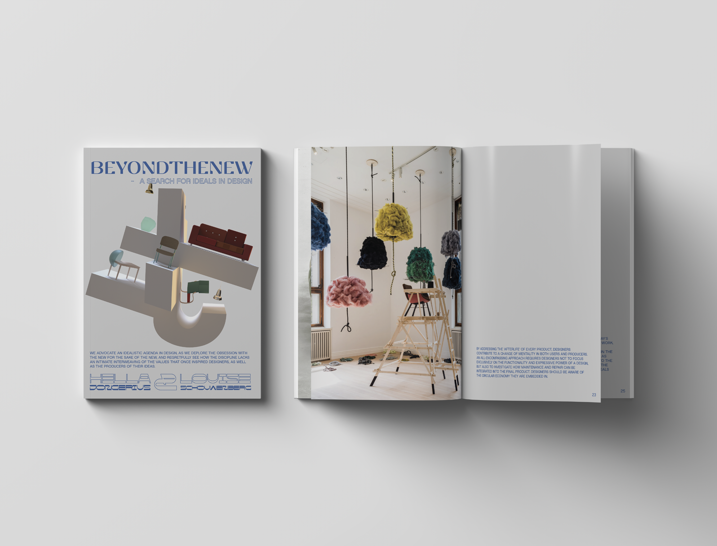
Originally the project revolved around the physicality of Hella’s industrial design. I still wanted to maintain this idea, but I wanted to do more as well. I found inspiration from her writing Beyond The New. I wanted her work to reinforce the ideas in her manifesto.
3D Elements
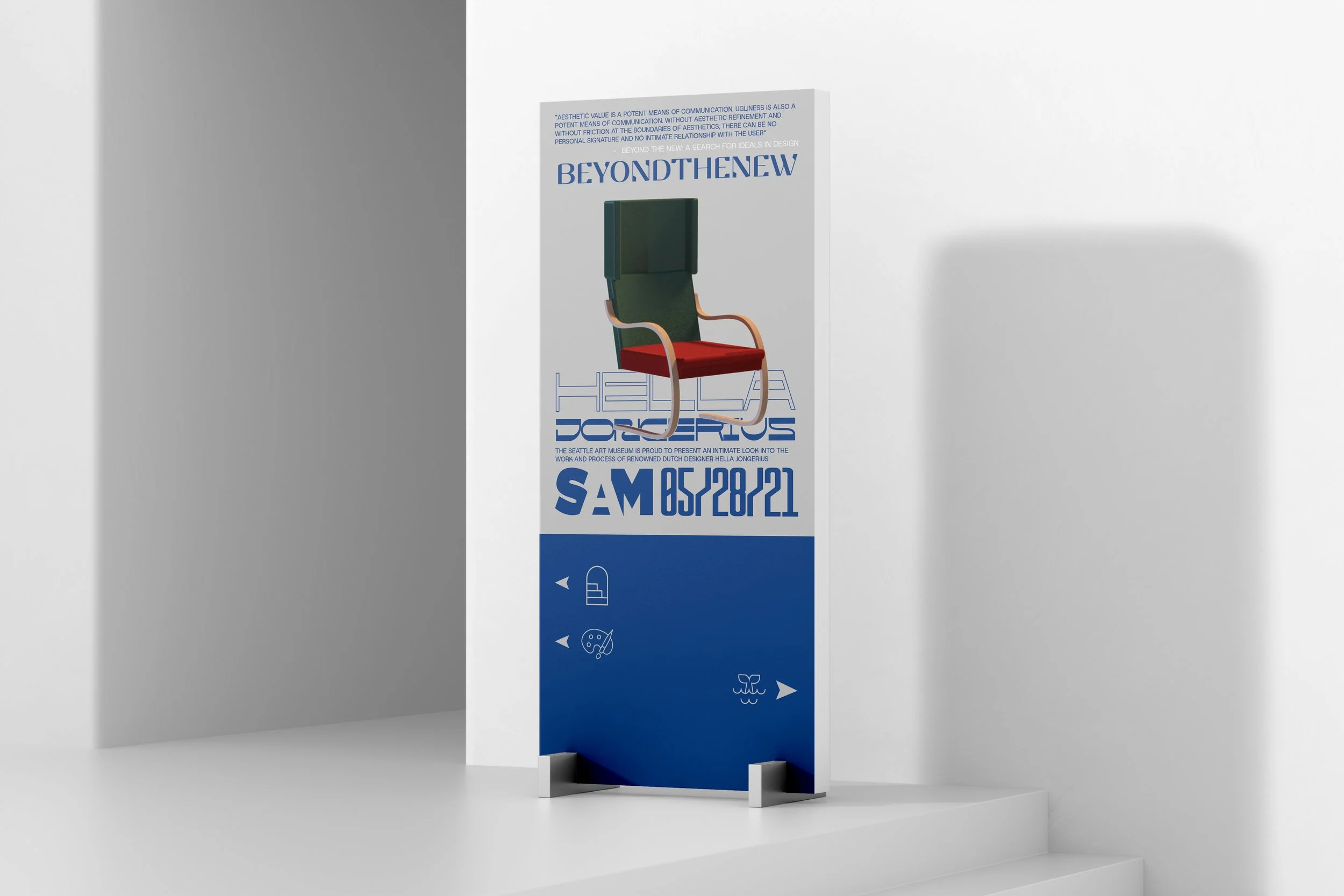
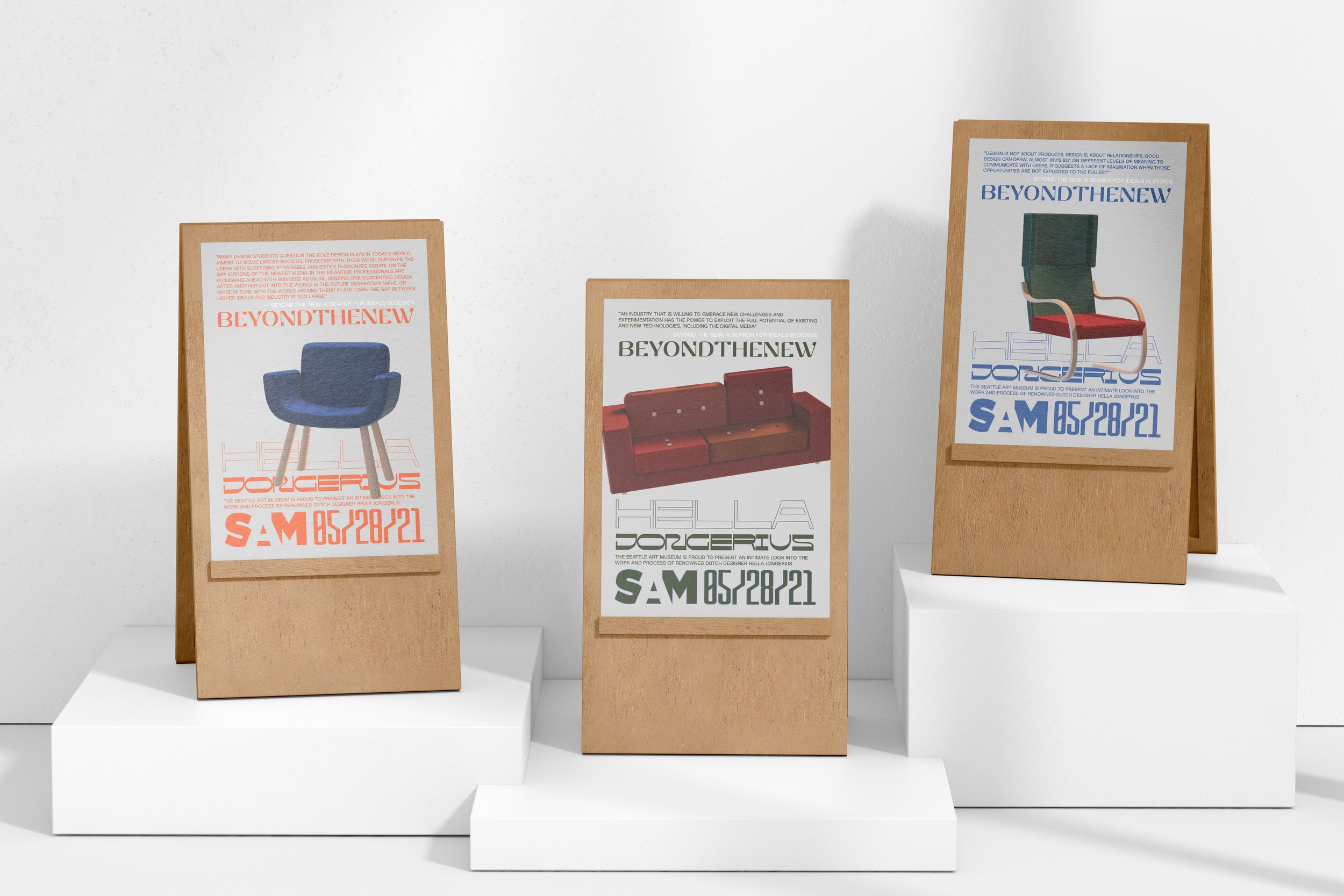
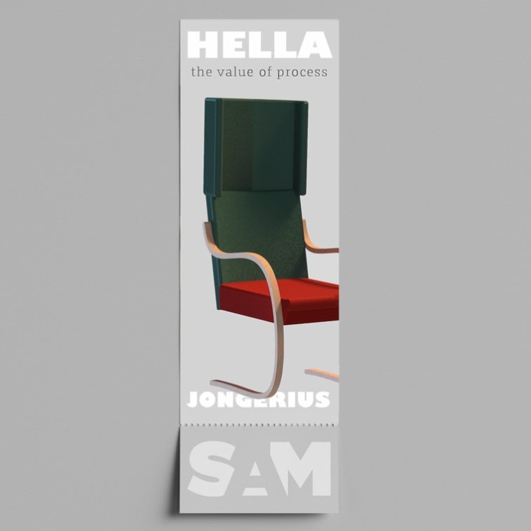
I felt the 3D elements I had created were misused in the initial brand. Rather than one large logo, I also wanted to highlight specific objects in space to showcase their design.
Typography
I felt the original typography, while fine, lacked a distinct look and identity. I wanted it to speak to the idea of “Beyond The New” rather than just be a clean canvas for the 3D elements.
Color
I wanted a stronger color identity to better define the show and elements of the brand. Her work itself is quite colorful and I felt the branding as it existed didn’t speak to that playfulness.


iterations
As this was a project I was re-visiting, I already had a strong idea of what elements I did and didn’t like. Through the iterations I began to consider type, color, and the utilization of my 3D elements.
Iteration 1:
Through my ideation phase, I had already identified what I wanted to improve. While my 3D elements were interesting by themselves, I knew both typography and color branding would be important, as would the integration of the ideas in Hella’s writing Beyond the New.
ITERATION 1:
Iteration 2:
For the second iteration, I focused on typography. Her work focuses quite a bit on modularity, so I looked for fonts that blended sharp and curved angles, and fonts that I felt built or subverted classic font shapes.
I attached myself to the idea of text as texture. I wanted to create a visual field of text that would fall away as the eye centered on the image.
ITERATION 2:


Iteration 3:
Drawing from the furniture as well as color study works that Hella had done, I attached myself to five colors that I felt covered the color spectrum and would push the work.
By adding color branding, a uniform visual identity was established. Color is very important to the work that Hella does, and it felt right to include a wider color palette.
ITERATION 3:


After working through my iterations I finalized components and guidelines for the type, color, and illustrations creating the visual identity.
brand Components
Typography:
Because I wanted the type to act as a field of visual information I decided to use three fonts to create variety. Rather than size, I focused on creating a full-width effect that would span the visual block. I used 15 px spacing between text blocks as a guide and used a combination of fill and outlines to create a visual hierarchy of information.
I chose EP Stellari Display as the title font due to its modern play on serif fonts and decided against using spaces to create the effect I wanted.
I used Fleuron for body text for its legibility and the interplay it had between curved and straight edges.
For similar reasons, I chose Polonium for its use of curved and straight edges and its juxtaposition to EP Stellari.

Color:
I chose five colors and two neutral grays to be the foundation of my color palette. Chosen from the work of Hella Jongerius and her obsession with color, I wanted them to work with the typography to create visual fields on which the 3D elements could play.

Illustration:
I felt the 3D illustrations that I created did an effective job of showing Hella’s work as it was intended, as objects that take up physical space and that can be engaged with. Instead of focusing on one larger compilation, I wanted each piece of furniture to stand out as an individual element.

the brand identity
A proposed exhibition of Hella Jongerius’ work at the Seattle Art Museum. Inspired both by the physicality of her work and her writing Beyond The New, the show highlights her industrial design and the principles that guide her process.