Sikut iqimaniri
A collection of Inuit folktales examining the ubiquity and movement of themes in Inuit lore accompanied by traditional art and column analysis which illuminates the stories. Designed and printed in both silkscreen and risograph as well as hand bound by myself, they come in an edition of 10.
the study of folktales
Through my class Polar Imaginations: The Western fascination with the North and South Poles, I became fascinated with Inuit folktales. As someone always partial to stories and storytelling I wanted to create a project that merged the research I had done, my design and print practice, and spoke to the stories importance.

My original paper focused on the Macro and Micro evolution of Inuit folktales. To accompany the analytical I conceptualized a project that would look at the more esoteric and philosophical nature of the stories themselves. Taking this into account I formed a collection of stories that I found particularly interesting for their ubiquity or content.

ideation
After deciding on the collection of stories I wanted to use I quickly fixated on the form of an intimate book. While I played around with the idea of a series of posters or booklets, I wanted to create a solid object that reflected their importance rather than dissemination of information. From there I created core principals which the project would follow.
Form fitting the content
I wanted the dimensions and layout of the pages to evoke the environment in which they were originally told. Especially because they were culturally shared over such vast expanses, I wanted that ubiquity to be shown through the layout.
Rooted in the analytical
My basis originally stemmed from a place of analysis. I realized I didn’t simply want to re-tell the stories in a beautiful way, especially because they aren’t really mine to tell.
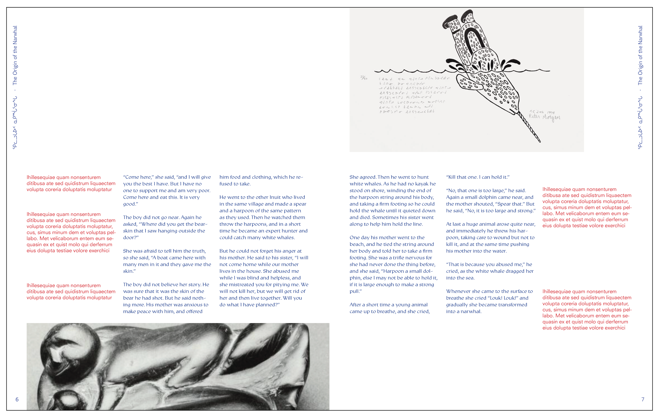
Found images
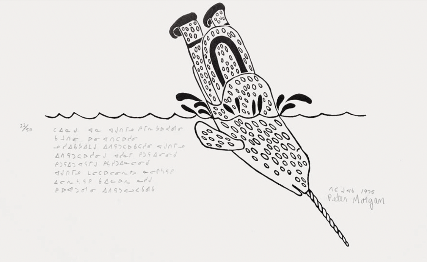
While I originally thought I might make my own illustrations to pair with the text, through my research I found many Native artists which I felt captured the stories better than I ever could.


iterations
With my core principles in mind I started working on the books layout.
Iteration 1:
Trying the obvious I played with an expansive horizontal and narrow page however I quickly found the format made the text-heavy content look bulky and awkward. Instead of finding space for my side column analysis, I found myself struggling to contain all the necessary information.
Iteration 1:
Iteration 2:
By trying a magazine-sized page I started to switch horizontal space with vertical space creating a similar effect of expansiveness. However, I still felt that there was lots of wasted space and that it felt less intimate as an object.

Iteration 2:
Iteration 3:
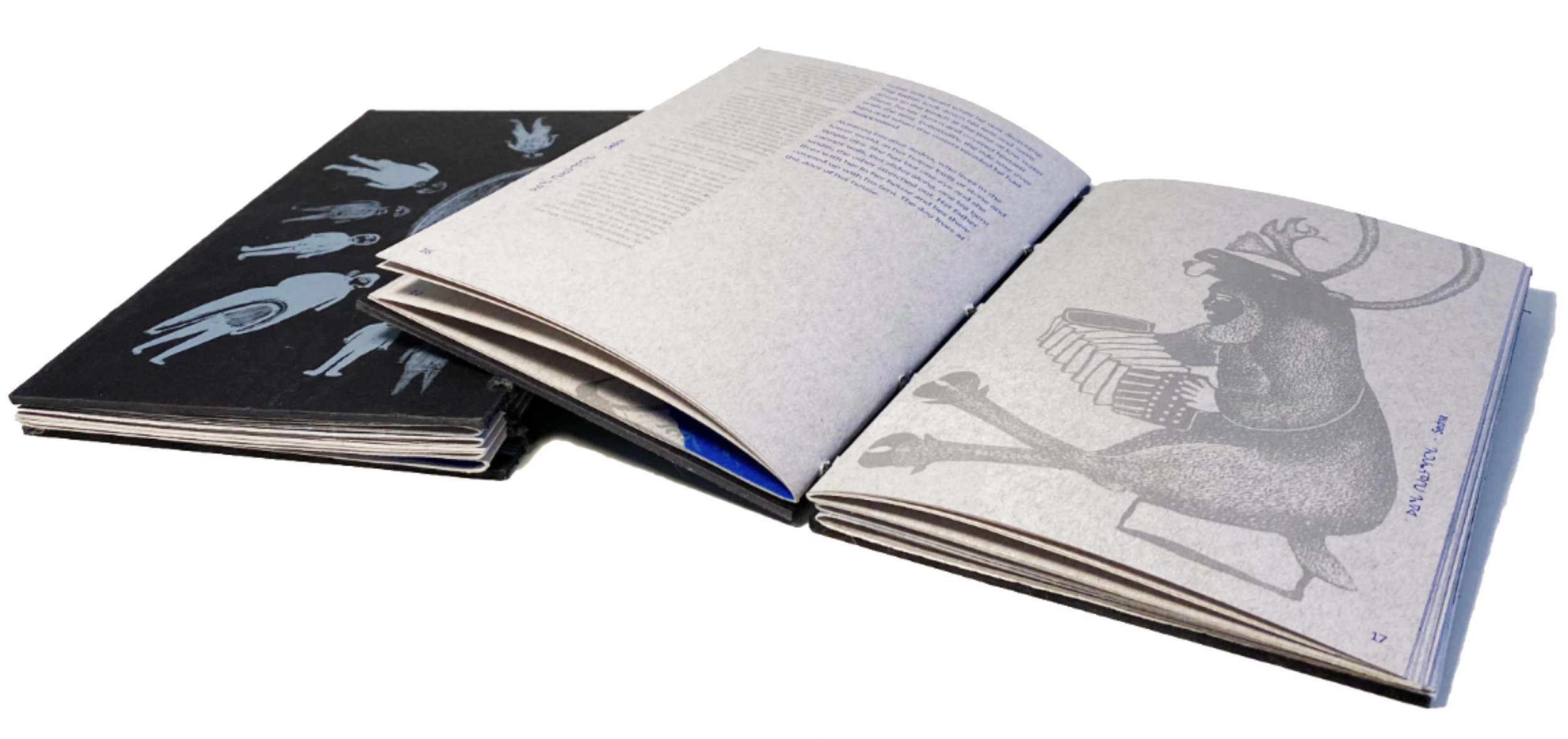
By creating a smaller page size everything started falling in line. From the realities of print production to the effect of verticality and space and the intimacy and hand held quality I wanted the object to have.

Iteration 3:
aesthetics
In considering the realities of print production I found that I had some limitations in color, paper, and dimensions, however, it was an interesting challenge to blend fabrication with design.
Typography:
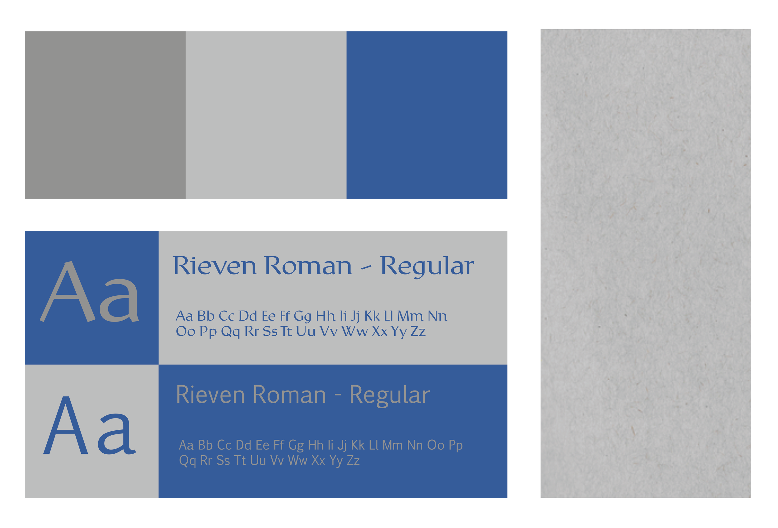
For the body text, I chose Rieven Roman. As an Uncial type font I found its rounded forms to be legible, open, and easily accessible paired with images, and the more neutral secondary font while also evoking historical and sacred texts.
For the secondary font, used for all side captions and all other type appearances I chose to use Pigiarniq. I chose it for its readability, matter-of-fact visuals, and its inclusion of Inuktitut syllabics, as it is a widely used font for Inuit texts.
Color:
Because the print shop had a limited number of inks that the risograph could print in, I chose a bold blue and light grey. The blue, because it was visually strong enough to be used as a body text color, and the grey because it could carry column annotation, while not intruding on the actual story narratives. Additionally, both inks had a wide variety of hues in which it could print images with more detail either alone, or layered and I found each evocative of the natural landscapes they were ultimately describing.
Paper:
Originally I chose what I thought to be a heathered grey natural fibered paper that would play off the colors of inks that the print shop had. The product that was delivered to me was much warmer than I expected, however, I felt the warmth created interesting effects with the inks and the object as a whole.
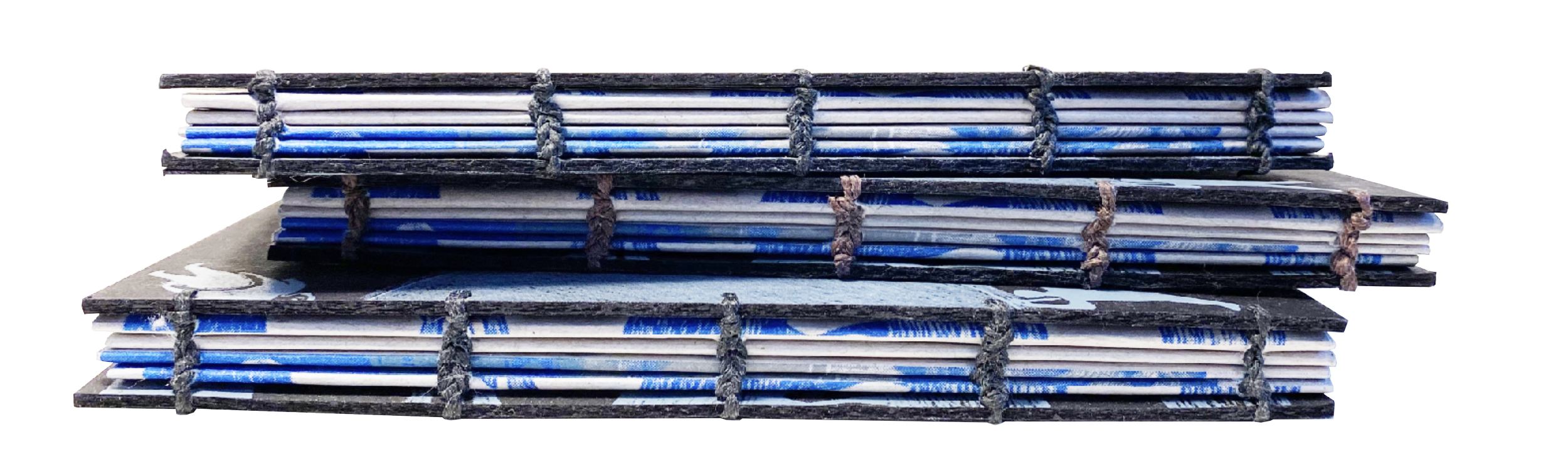
Binding
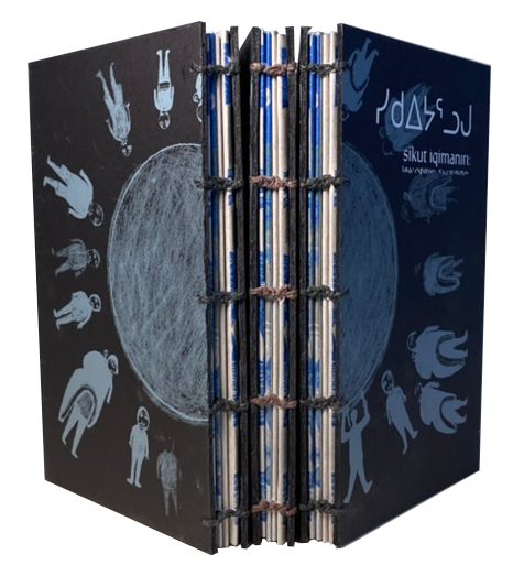
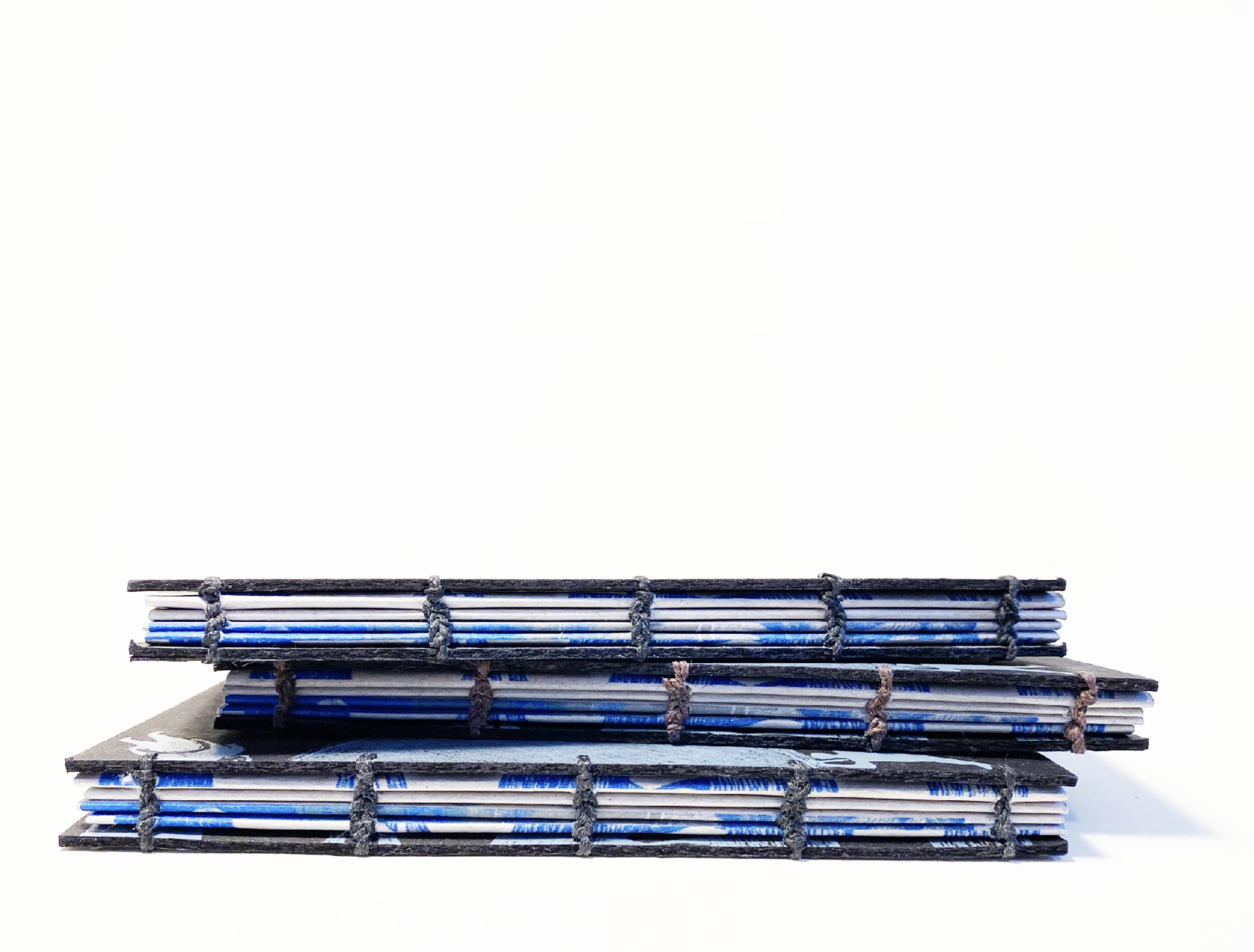
I decided to use Coptic binding for a number of reasons. I wanted an open edge that created visual layering evocative of compacted ice, while also revealing the handmade quality of the book manufacturign. I also wanted the pages to lie as flat as possible for open spreads, something I knew Coptic binding would allow.
the final object
Coming in an edition of ten, each page was printed four times, two runs for text in each color, and then an additional two times for images in both colors. The covers were then printed with silkscreen and finally hand bound.