rhoda lubalin fellowship website
For the year 2022, I was awarded the Rhoda Lubalin Fellowship. Established by the wife and collaborator of Herb Lubalin the fellowship was created to support rising seniors and newly graduated Cooper Union students in an ambitious design project for the Herb Lubalin Study Center. With a classmate and co-fellow, we created an archive of past projects for use by students, faculty, and the public. I was responsible for branding, web design, and UI/UX planning.
imagining an archive
As 2022 Rhoda Lubalin fellows, a classmate and I created an archival website for all past fellowship projects, to be used as a public resource. Our project was built upon the work two fellows had done in the previous year.

The two previous fellows had created a conceptual approach to the site and a basic wireframe of the content. They identified the main objectives of the project as a space for people to learn more about the fellowship, to document past fellows’ work, and to honor Rhoda Lubalin herself. Keeping these core ideas in mind we created a visual identity, design guidelines, and brought the website to life.
ideation
We initially took inspiration from the Herb Lubalin Study Center’s existing branding as well as its past website projects. In going through the archive and looking at past fellowship projects we settled on key ideas that would guide the brand.
Part of a collection
Given that the website would be an extension of the Herb Lubalin Study Center while also being its own entity, we wanted to create something that felt clean and striking, yet part of something larger.
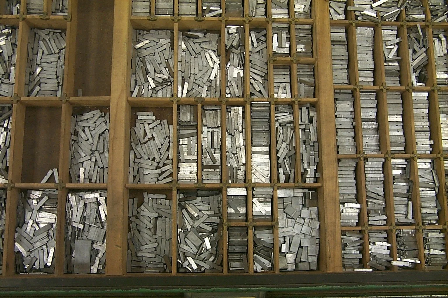
We felt visually connected to the imagery of the California job case. Both a relic of type and graphic design itself, we felt it alluded to the history of the archive, as well as the unique possibilities and individual colors of fellowship projects contained within a larger framework.
Flexibility
We knew that the website itself would have to be flexible enough to contain a variety of information and content. Any form the website might make would have to be modular enough to manage this, as well as neutral enough to complement the content.


the logo
Keeping in mind our guiding ideas we first created our logo. Because the previous two fellows had left guidelines in terms of content and mission, we felt that by creating the logo first, we could then create a system surrounding the logo in a more holistic imagining of what the site could be.
Iteration 1+2:
While we initially tried Lubalin-esque type lockups, we eventually decided that the grided California job case-based design was more representative of the fellowship archive and the needs of the website.
ITERATION 1 + 2:


Iteration 3:
The final logo we settled on is user interactive. Using a variable font we created a mouse-over effect that played on the unique aspects of each project all within the larger framework of the fellowship.
ITERATION 3:
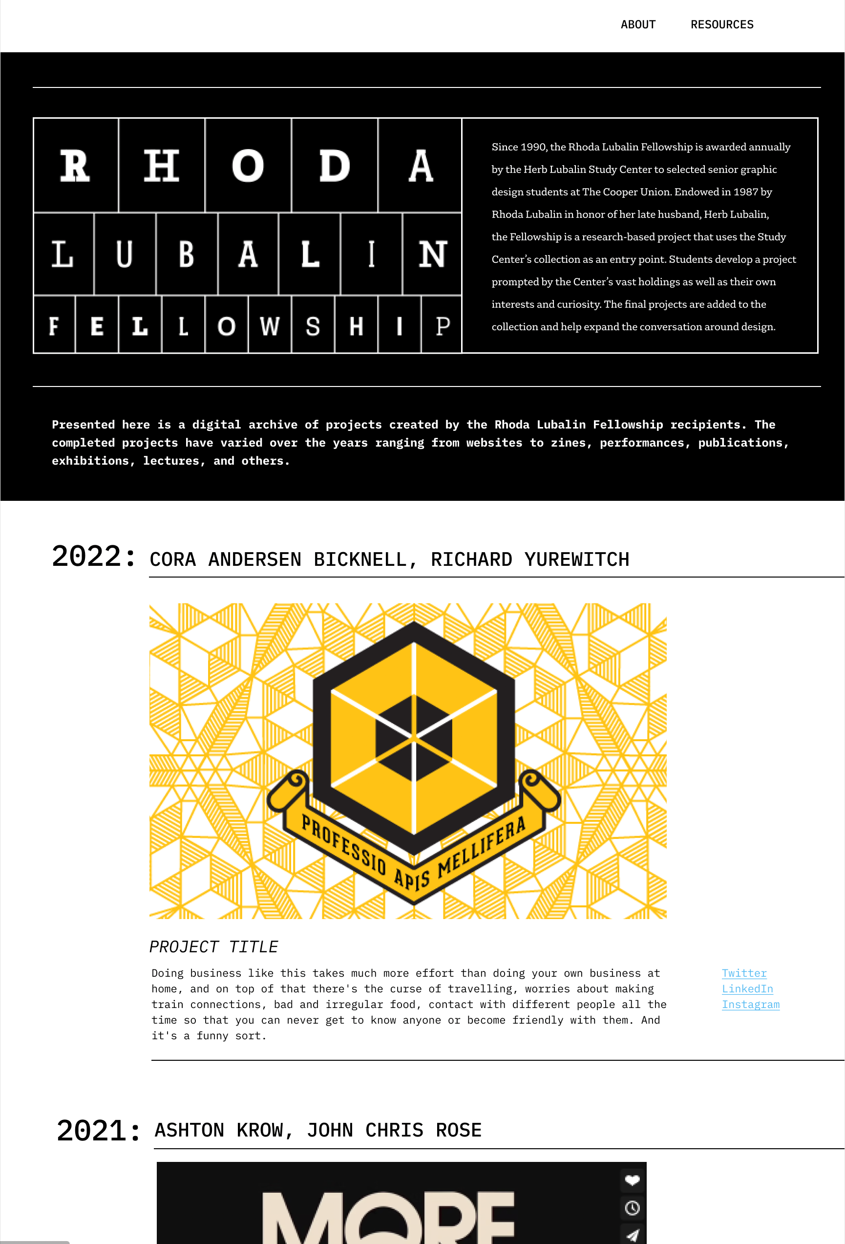
home page
Using the logo as a guidepost for the rest of the design we decided on creating a grid-like system to contain the basic information for each project. Using hero images as the highlight of the project we created a modular solution that once again alluded to the job case.
Iteration 1-3:
Keeping in mind our design objectives of flexibility and the design ideas we explored with our logo we moved through many different iterations to try and contain all of the information we needed while maintaining legibility and user engagement. We tried expanding lists, large images, small images, and a variety of font hierarchies.
We found that our most successful iterations utilized the grid-like system we created for the logo, smaller hero images, and a type hierarchy that emphasized the fellows as they were key to the website’s coding hierarchy.
ITERATION 1 - 3:


Iteration 4:
We settled on utilizing a grid similar to how we initially imagined our use of the logo. It helped give the content we needed to include more structure and definition while also creating uniformity within the page and within the site as a whole.
ITERATION 4:
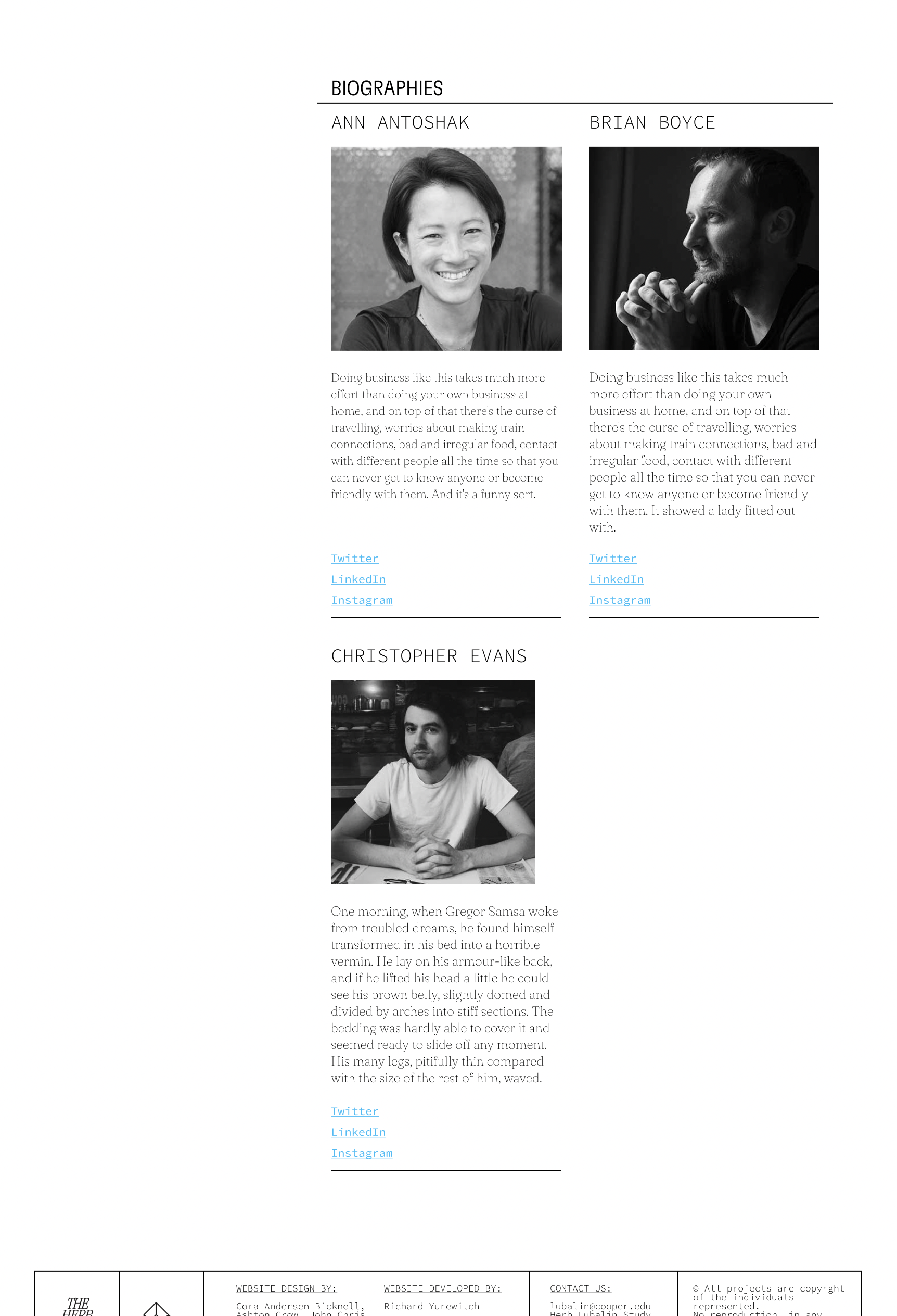
project pages
We knew the content on individual project pages would vary greatly. Because of this, we wanted to create a layout that would be able to flex to any content or media needed. Using a project with a wide variety of different content we created a variety of different iterations.
Iteration 1-3:
Knowing that the pages would have to contain a variety of content ranging from links to pdf to photos to videos we chose a project with a variety of content. We tried a variety of different layouts that felt both flexible and included elements of the modular grid systems we had started fleshing out on the previous page.
We found that our most successful iterations abandoned the grid system save for specific moments. Over any aesthetic, we felt it was most important for the content to have space to breathe and be as legible to the viewer as possible.

ITERATION 1 - 3:


Iteration 4:
Using a much more open grid system we found a happy in-between that used our modular grid system for biographies and links leaving the rest of the page open for content to have enough room to shine and be legible to the viewer.
ITERATION 4:
the Final site
An archival website for past and future Rhoda Lubalin fellows. Cataloging and recording past fellows’ projects, the website will act as a resource for Cooper Union students, alumni, designers, and members of the general public. Key to the site is imagining and celebrating the possibilities of each project.