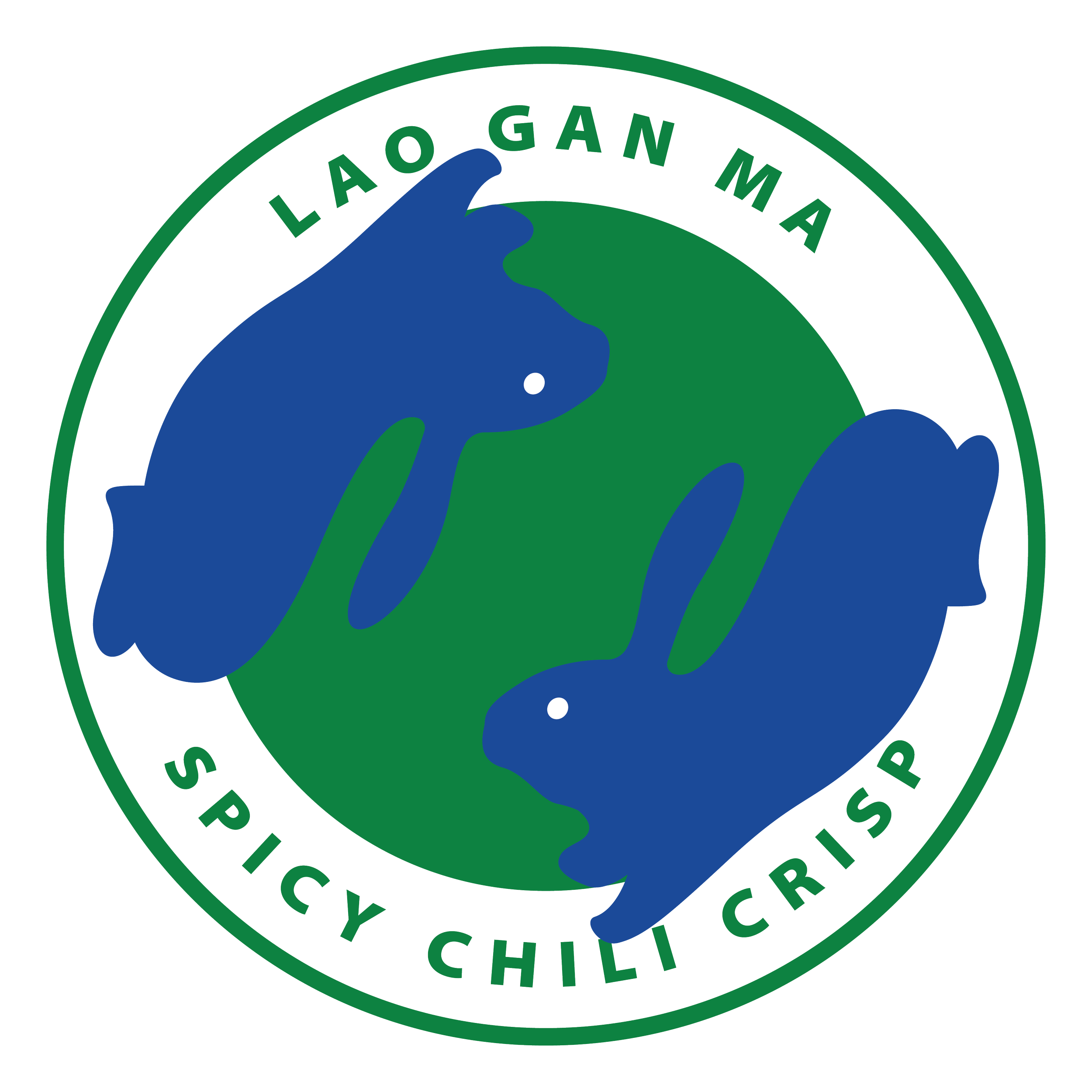
Lao Gan Ma: Chili Oil Rebrand
Lao Gan Ma chili oil has openly stated its desire to sell its products cheaply domestically while gaining profit abroad. Using Chinese American food service iconography I chose to use the language of appropriation to create a re-brand exclusively for Western markets.
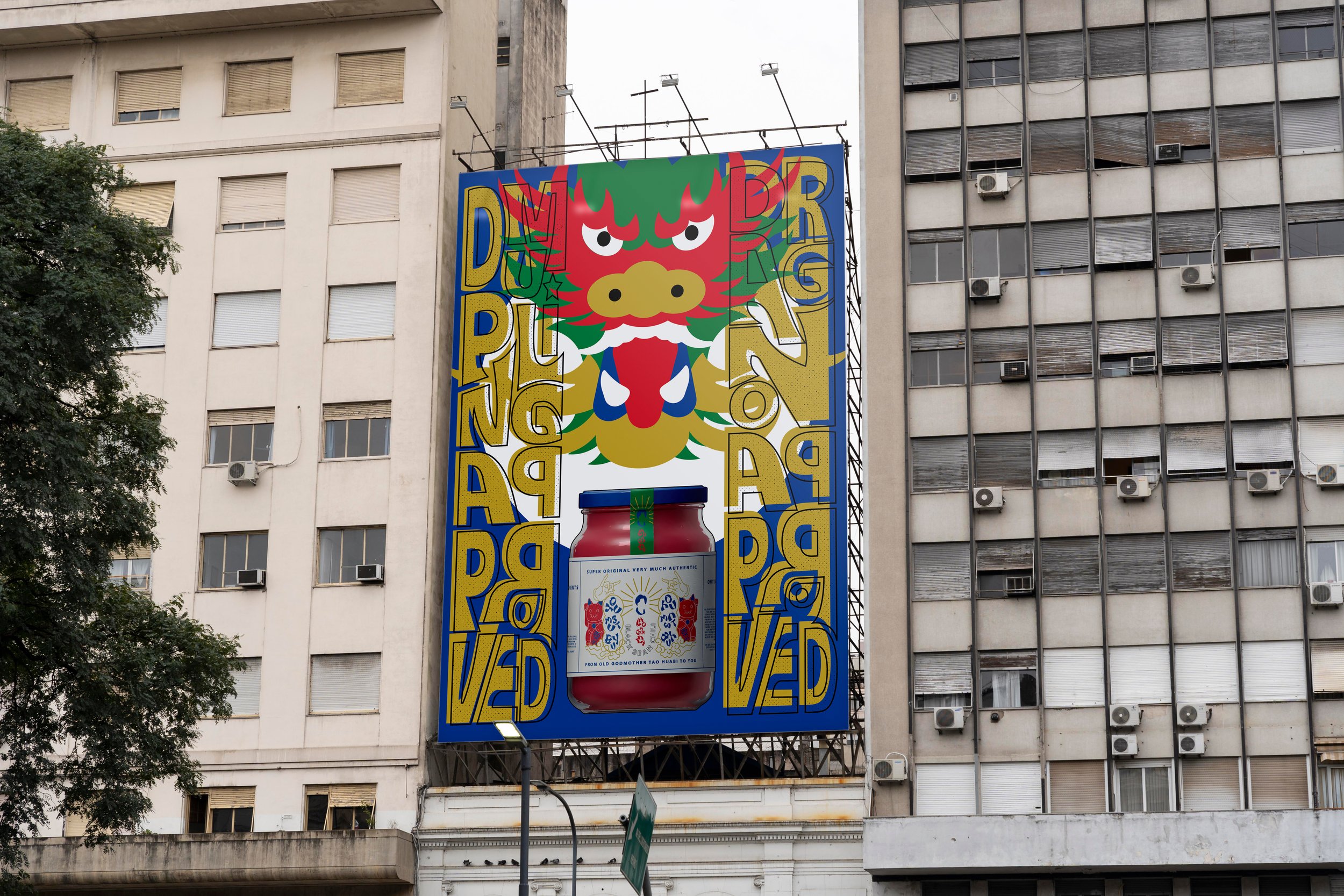
an iconic brand brought to the west
As a cult user of Lao Gan Ma Chili Oil, I wanted to create a project that paid homage to that love. While I think the original branding is iconic in its own right in considering the project it brought up the important question “why re-brand something beloved?”

Because a general “refresh” felt superficial I delved into research of the company and was amazed by the founder Tao Huabi’s story. A true rags to riches story Tao Huabi was widowed at a young age and with two young children to provide for and no real education to speak of she created a chili oil empire valued at 1.05 Billion dollars. I wanted to make the re-design based off her values, and her goals for the company.

ideation
The business had always been about giving friends and family a taste of home, and economic opportunities. With Tao Huabi’s mission at the heart of the project, I delved further into interviews she had done. Discussing the price discrepancy between domestic and sales abroad (two bottles sell for $1.50 in China vs. $13-18 in the US) she stated, “I’m Chinese. I don’t make money off of Chinese people. I want to sell Lao Gan Ma to foreign countries and make money off of foreigners”.
Packaging for a Western market
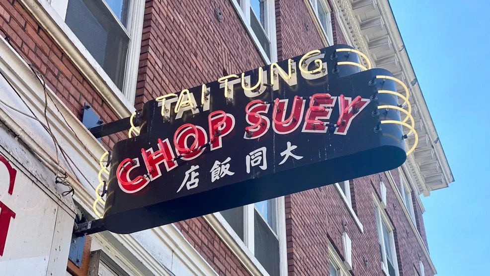
Given the statement, I decided on taking a satirical angle on the project. I researched the history of Chinese food in America was inspired by the “self-appropriation” that many Chinese restaurants underwent to appeal to the Western market.
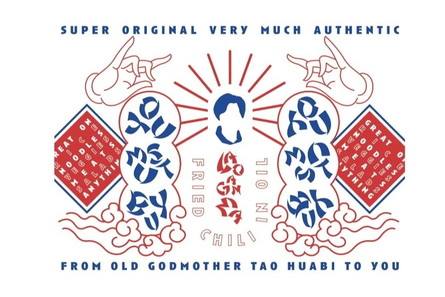
Tao Huabi clearly has domestic economic interests, but she also takes pride in her product. I wanted to keep certain elements of the original packaging that speaks to the authenticity of the product as a code-switch underneath the superficial.
Specialization vs. Simplicity
The original product design is iconic to those who use the product, but for a newer audience, it’s difficult to pick the product out. Using both illustrations and color I wanted to create a solution that both stays true to the original ideals and can stand above the competition on the shelf.


iterations
Keeping in mind the satirical angle I wanted to take and the balance between specialization and simplicity I started working on iterations of the design. Selecting the top three best-selling products of Lao Gan Ma, I worked on creating a branding guide that would work across the products.
Iteration 1:
Starting from the original logo, I initially was drawn to the portrait of Tao Huabi. It reminded me of religious icons, as well as Communist propaganda portraits celebrating Mao Zedong. Starting with bold primary colors, I tried to refine the portraits. It helped solidify the project’s palette, but the portraits felt like small iterations of changes, rather than a re-brand.

ITERATION 1:


Iteration 2:
I started making further progress when I decided to convert Tao Huabi’s portrait into an icon. It helped me decide on a more vector-based illustration style and pushed the idea of Tao as a glorified figure.
My type hierarchy was clarified when I started using the stereotypical Chinese font as characters and a graphic element rather than a font itself. While I initially used one color or two colors for the design, I found it blanketed the hierarchy of information I was trying to establish.

ITERATION 2:

Iteration 3:
I added further stylized illustrations which helped create a friendlier and more defined look while establishing the style as a combination of bold color and line-based illustrations.
While I felt the two-tone label got closer to establishing the hierarchy I wanted, by adding two more colors that would stay uniform across the labels, I was able to create the effect I wanted.

ITERATION 3:
After working through my iterations, I created finalized components and guidelines for the type, color, logo, and illustrations for the re-brand.
brand Components
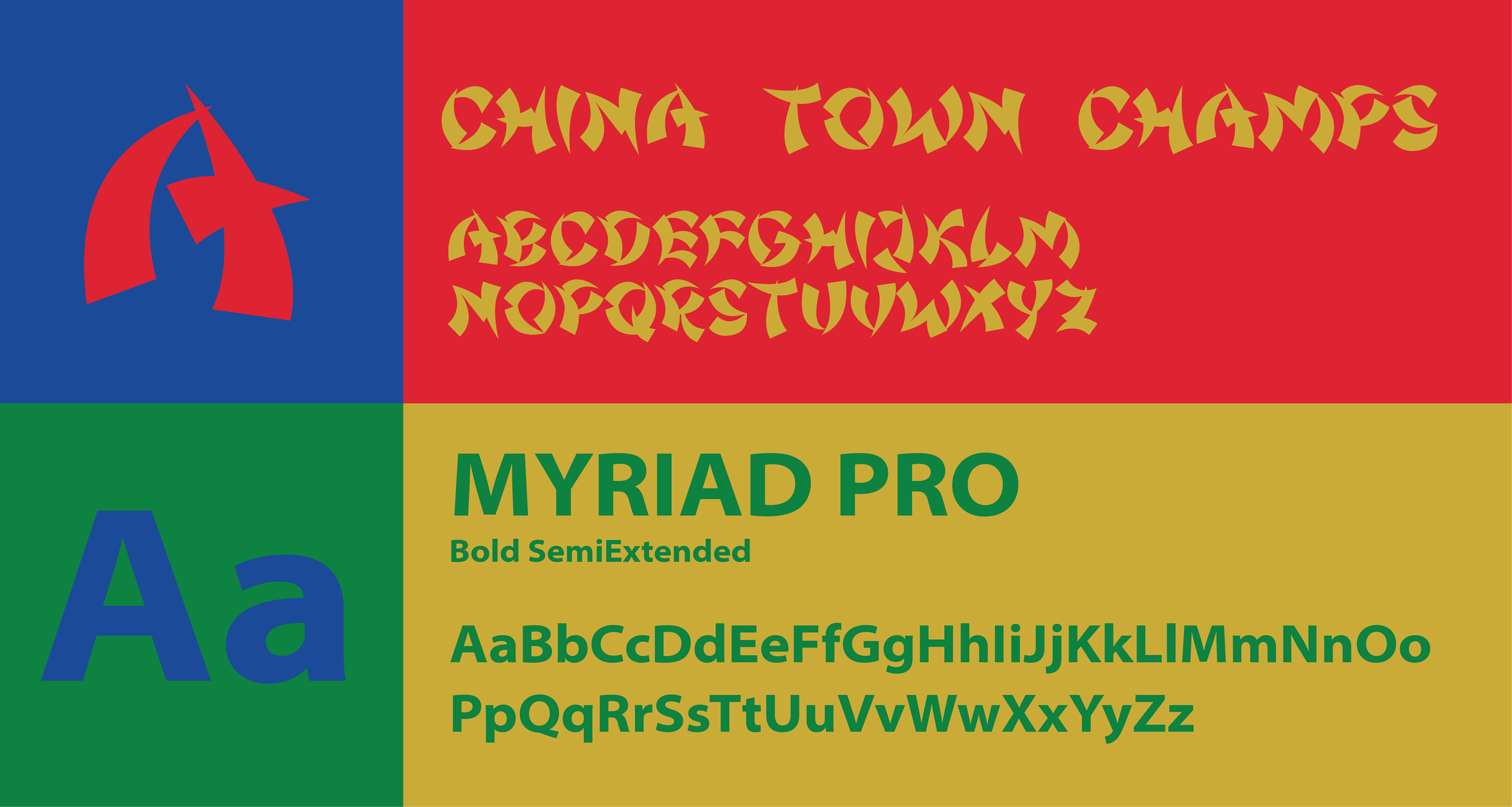
Typography:
For all specialized placements of font, I used China Town Champs. Developed for newspaper use in any “oriental” ad placements, I felt it had an authentic Americanization to it and an illegibility which lent itself to be used as characters instead of type.
For all other text, I used Myriad Pro, for its ability to act as a neutral, legible foil to China Town Champs as it’s clean enough, yet solid enough to hold its own.
Logo:
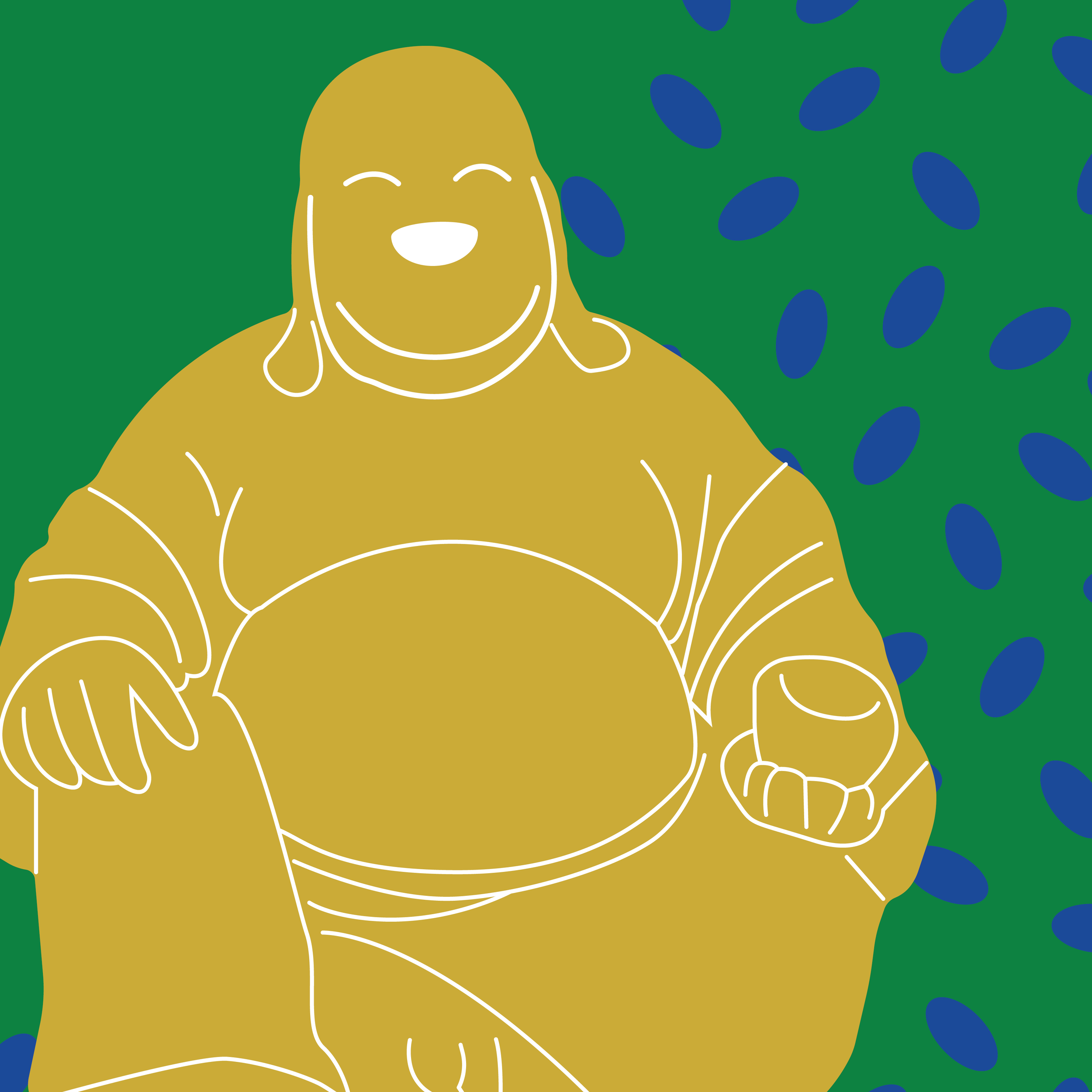
From the original packaging, I picked up on a subtle halo surrounding Tao Huabi. The image itself reminded me of religious icons and images of Mao Zedong and I wanted to play on the glorified nature of Tao, as a Chinese success story. For both the type and vectorized portrait, I liked the play between whats legible, and whats meant.
Color:
Chosen both for legibility and use in Chinese temple buildings, I chose a subtle variation on a primary palette. The simplicity of the colors meant that through various color combinations there was both specialization and simplicity.

Illustration:
Alongside the illustrations that I created for the packaging, I also created three brand “characters” to be used in promotional material. In contrast to the more line-based packaging, I used bolder forms and colors to illustrate characters from Chinese lore and Zodiac.


the Final product
A satirical re-brand of Lao Gan Ma’s iconic chili oil. Created especially for a Western market the project uses hallmarks of Chinese American food culture to re-examine and re-appropriate stereotypes and play with legibility.